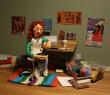
The lighting for this piece has been driving me crazy. At first I tried lighting it with the television (from the front) but the result, though cool looking, was not something that would ever work in print. Here are some of the better options I came up with (over 100 pictures right now). I love the shadow of Matilda's father on the wall, but it limits the direction from which the light can come (and adding another light results in multiple shadows). Any suggestions or personal preferences would be appreciated.


1 comment:
The very last one feels a little blurry to me, but I love the multiple shadows from the father, which makes it my favorite. I also miss the texture from the TV in the last one.
The last two have the advantage that I can easily tell that those are pages on the floor, while the lighting in the first two makes that hard to see.
I just like the more dramatic lighting in the last two more than the first two, can you tell?
Post a Comment